
If you work with Salesforce, you’re probably familiar with Salesforce dashboards. These dashboards are a way to view real-time analytics and reports on a single screen. Many companies use them to track KPIs and other reports to see how their business is performing. While it may seem overwhelming to think about what to include in a dashboard, there’s a few key things to keep in mind. Keep reading for our suggestions on how to best utilize your Salesforce dashboard.
Salesforce Dashboard Components
As mentioned in the opening paragraph, there are different components to a Salesforce dashboard. These components are the pieces that make up a dashboard. For example, these include charts and metrics, which come from data gathered off a report. You can arrange these components in multiple ways, showing the information you think is most valuable to your team. Here’s a list of the different types of components:
- Chart - Used to show data graphically and comes in many types
- Gauge - Shows a single value within a range of values
- Metric - Can show a single key value
- Table - Can show multiple values from a report
- Visualforce Page - Used when you want to create a custom component
- Custom S-Control - Shows content from a browser
To see more about Salesforce Dashboards from the experts themselves, click here!
Reporting in Salesforce
Much of what is shown on the dashboard comes from Salesforce reports. Reports are virtually a must-have if you’re conducting any selling activity within Salesforce. Like with other types of reporting in general, these help you visualize your efforts, activity, results and so much more. Within Salesforce, you can build these reports based off of your Salesforce data. Meaning, anything that gets logged or uploaded to Salesforce can be used in these reports.
Also, there’s many different types of reports in Salesforce. There’s multiple report types, report formats, filters and fields you can use to ensure you’re able to find and visualize the information you want. Using these reports to help drive future goals and ways to achieve them can help give your team a great boost.
To see more about Salesforce Reports, check out their page about them!
Salesforce with Salesvue
While the Salesforce dashboard can be a good tool on its own, it can become a great tool with Salesvue. Salesvue is a Salesforce-native sales engagement platform. Essentially, it brings all the benefits of a cadencing solution within your Salesforce UX. While the clear benefits include not needing to sync your data or click between multiple tabs on your desktop to complete a task, a big underlying benefit is a boost to reporting.
By combining these two solutions, you make it easier to create and visualize reports within Salesforce. Rather than using a non-native platform and having some reports in that system and others in Salesforce (often with conflicting data), all you need will be within Salesforce. Since you complete tasks using Salesforce objects, your reporting will come from Salesforce data, with no conflicting numbers or results. You’ll also get additional data points from using Salesvue cadences, such as call and email activities, or the success of certain touchpoints in a cadence.
Salesvue Report Types
Having access to generate our reporting using Salesforce data gives us the opportunity to create some truly meaningful reports. Yes, we can still show you common KPI metrics that you may want to track. However, we can also show you reports that can help drive your business to success. Here’s some of our report types that help give actionable insights.
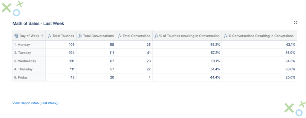
Math of Sales
Our Math of Sales report can be used in a variety of ways. Through Math of Sales, you can visualize what gives you the best outcomes based on any Salesforce field. These reports help you see what’s working and what’s not. For example, you can see here it’s best to focus your prospecting efforts by seeing which industry or job title generates the most conversations. Or you can see what marketing channels generate the most sales opportunities. The Math of Sales reporting capabilities can help you focus efforts, shift resources and scale best practices.
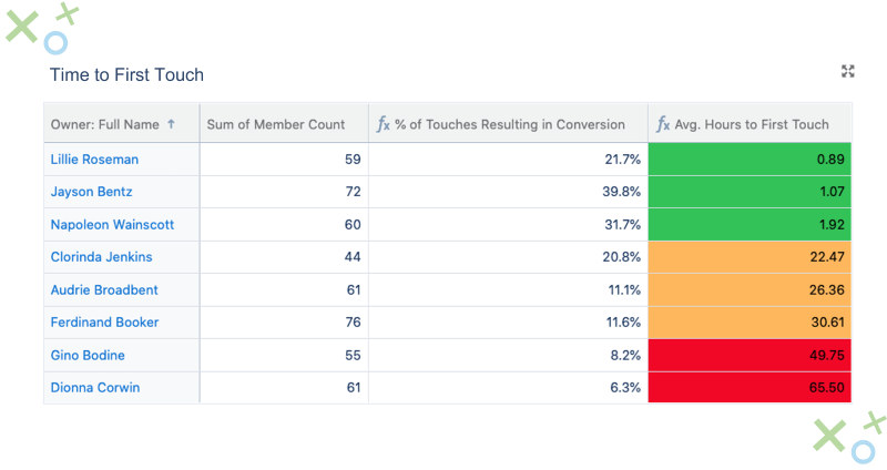
Time to First Touch
Another valuable report type from Salesvue is our Time-to-First Touch report. We understand that better responsiveness to inbounds usually leads to better conversion rates. So, we created reporting that can help show how well a team is responding. With our reports, you can see how long it takes each rep to respond to an inbound. So, you can see the time frame that gives you the best results and scale these best practices across the whole team.
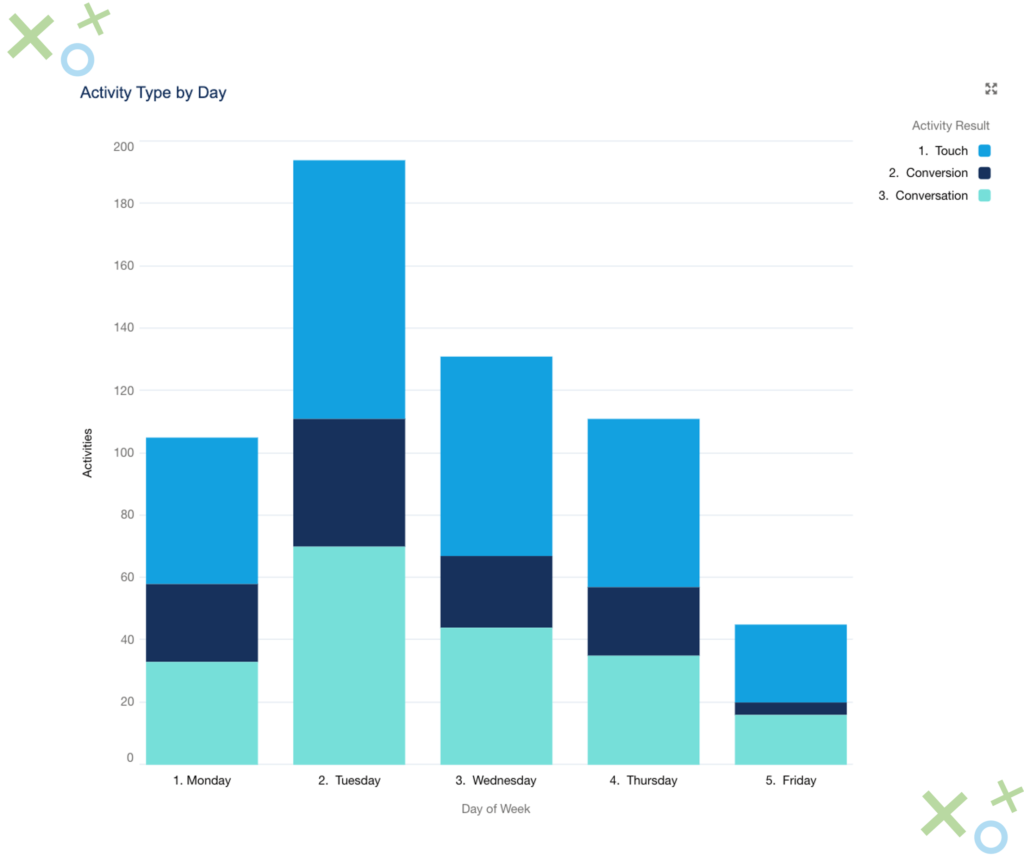
Activity Reports
Activity reports are another great way to see where to focus your efforts. With these reports, you can see your prospecting data come to live, giving you a better picture of what’s working best. For example, you can see what day of the week generates the most touches and conversations, letting you know where you may want to focus your efforts. If you get 3x the number of emails opened on a Wednesday rather than a Friday, you can adjust your cadences and sales process to reflect this.
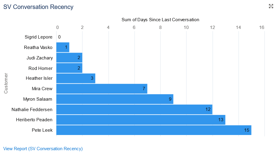
Conversation Recency
The final report type we want to highlight is our conversation recency reporting. No one likes to be forgotten. So, why not use a report that helps you make sure you don’t forget anyone. Whether that be prospects or customers, use a conversation recency report to see when the last time you met with them was. There’s a slippery slope between forgetting to reach out to a new customer for a while and ending up with them unhappy. Don’t fall trap to this and make sure you stay on top of everything.
Salesvue Reporting Benefits
Combining the snapshot that Salesforce dashboards provide with the meaningful insights Salesvue reporting gives your team can give your team the lift they need. Salesvue can help show you the metrics that matter. Go beyond basic KPIs and start seeing the analytics that truly drive your success. Salesvue’s reports can help drive meaningful change that will help scale best practices and improve processes. Once you find the reports that will help drive success for your team, highlight them on your dashboard to make sure you stay up to date on them.
Summary
Salesforce dashboards are a truly valuable tool. Seeing everything in a single spot can help you stay on top of what’s going on and find correlations between the reports. Also, you can create a dynamic dashboard in Salesforce so different team leads can see different information, based on what they deem most valuable. When you use Salesvue report types, you can go beyond vanity metrics and get down to what’s truly going to help give your team a lift.
Subscribe to Funnel Vision
Get the latest and greatest right in your inbox